We now had our Burraga Languages App MVP ready and we were moving to the next stages. Initially, levels were created in blocks of 5 and now we needed the level length to be customisable.
The static level length was useful to reduce complexity during phase 1 development and helped us to reach phase 1 more quickly, but now some adjustments were needed.

What next?
Though the current path design had served its purpose, it was static and could not be reduced. The need for customisation meant that the level length now had to be variable.
Constraints
In adding of this capability we needed to preserve the overall organic feel and general appearance of the game map. The change should not be a big one.
Building on the original
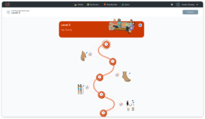
Using the original as a starting point, the path was tweaked to allow infinite repetition.
- The first and last main circles were shifted to be in line so that they could overlap. These acted as an anchor point for the repetition.
- The first circle now also acted as the fifth (or last) circle.
- The base block could now be repeated indefinitely and seamlessly.

Accounting for smaller increments
The base shape could also be broken into smaller parts so that the path could grow gradually.
- A game path could now be less than 5 levels.
- The path was no longer restricted to blocks of five.
- The number of levels in a game path was more customisable now that a path could have 2, 6 or even 126 levels. It was up to the creator.

The new game map shape would also serve as the base pattern for creating the game experience providing a more solid visual connection to the final product for the creator when building their game experience.


Additional adjustments
Now that game map colours could be chosen by the creator, some other tweaks were made to maintain readability and visual harmony:
- The centre of the main circle marker was opened up to be slightly larger so that there was more space to accommodate the marker symbols and numbers.
- The tint in the centre was removed entirely in favour of white to improve readability regardless of the colour chosen by the creator.
- The centre was changed from it’s irregular shape to a uniform circle to achieve a cleaner look when coupled with creator content which was variable.

Reflections
The result was a game map that could accommodate any length, was more readable, and that could better handle the variations that would come with a customisable experience whilst still maintaining the same feel as the original.
Next, I would want to think of a better solution for the unit headers which now have to account for variable colour schemes, since not all colours would preserve readability.