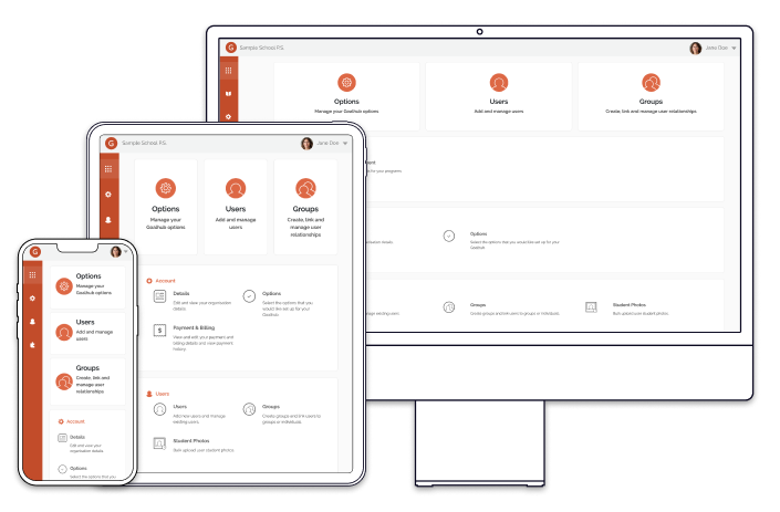
Increasing ease of navigation through complex platforms with dashboard and menu design.
An administration interface for a web application that provides teachers and schools with tools to deliver student personalised learning, supported with a goal-based approach and transparent parental oversight.
My role
Design of application admin area and icons, as well as contributions to enhancements and new features across various sections of the application. I also made some frontend development contributions.
Outcomes
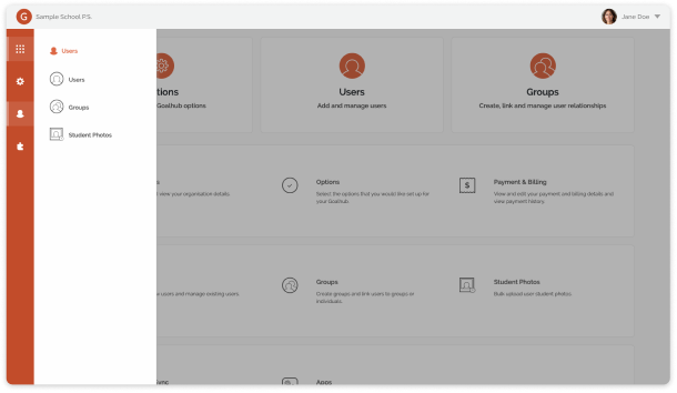
The result was an administration dashboard where each item was easy to find and clearly labelled with the most used functions featured as shortcuts at the top.
As part of the broader admin redesign, the new dashboard and menu structure played a key role in making everyday tasks less dependent on support and lengthy help manuals.

Designs
How did we get here?
The problem
School administrators faced a dated, complex interface that increased task times and left them having to rely heavily on instructional guides and support to complete key functions.
Background
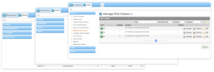
While the front-facing section of Goalhub had been redesigned and updated, the administration was still being done in a dated interface that was cumbersome and hard to navigate.
Goals
The Goalhub admin area needed a refresh and to be easily navigable despite being a complex platform with many features.
The goal was to:
- Enable smooth navigation through the Goalhub administration without getting lost.
- Reduce support overhead.
Who?
We were designing this for:
- The school administrator who does not necessarily have a high amount of technical proficiency. This could be a nominated teacher, the principal of the school, a school admin.
Users will be doing their administration tasks in a school office setting on their school computer.
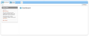
Looking at the original
Upon login the user was confronted with a screen that was effectively blank, providing no starting point or suggested next steps for school administrators.
These side navigation menu items also appeared to change depending on the viewed screen or which features were active, disorienting users and making it hard to learn where key functions were located.
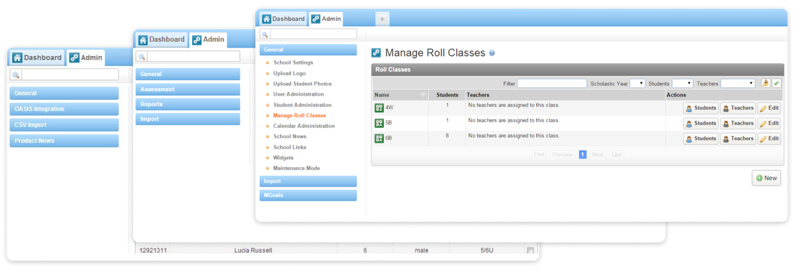
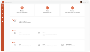
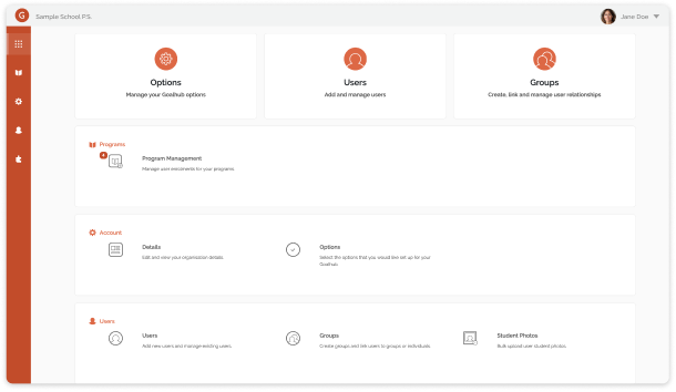
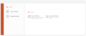
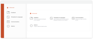
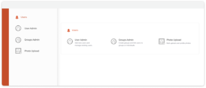
A menu that mirrors the dashboard
The dashboard was divided into sections to give a broader structure and so individual items could sit with related items rather than being arbitrarily placed. Functions that would be used most frequently and were the most essential appeared as prominent featured actions at the top of the dashboard screen.
Importantly, the dashboard hierarchy matched that of the side navigation menu so that the user could be better oriented as they moved away from the landing screen.
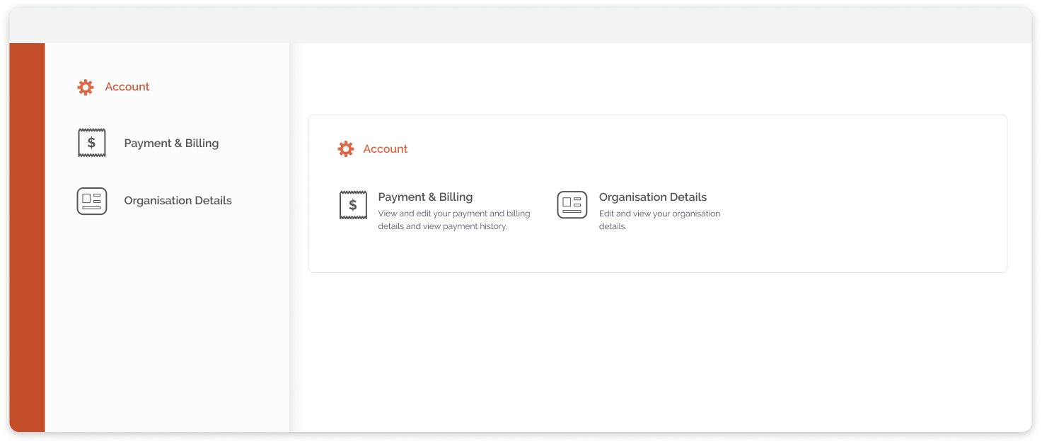
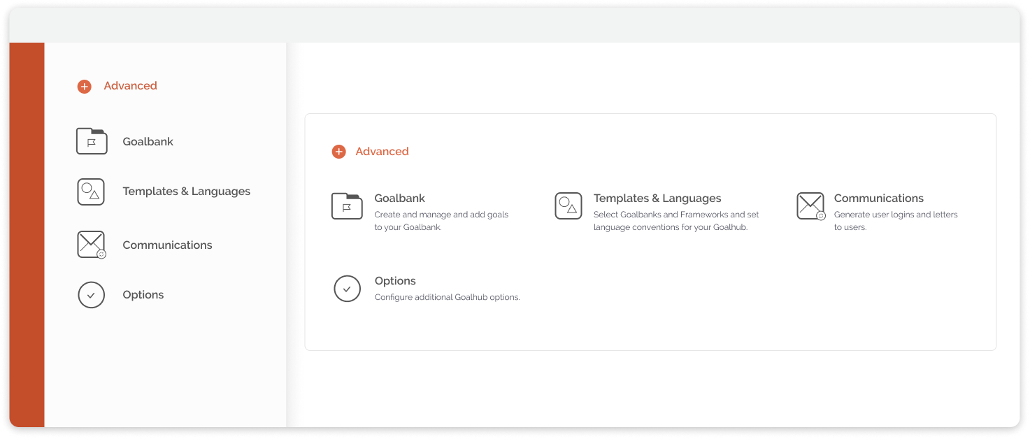
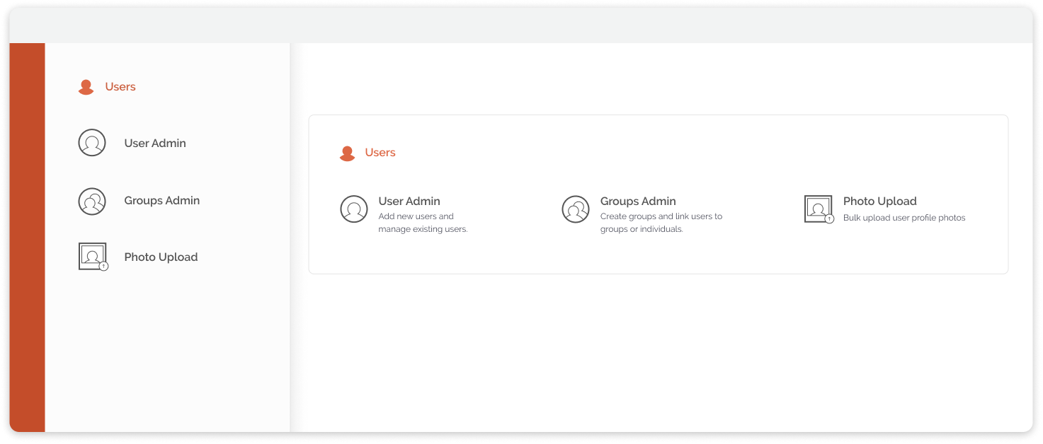
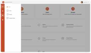
Creating an icon set for the dashboard
The icons had to be featured on both the dashboard and the menu and needed to be understandable at a glance. The icons had to fit with icon sets already created for the front-facing part of the application visible in student, teacher and parent accounts. I used a square shape as a template for the icons and used parts of already created icons for existing ideas to maintain cohesion.
Smaller icons were created to indicate sections without being overpowering. The section icons would be filled in making them more visible at a smaller scale and distinguishing them from the page icons. These were used as identifiers in the side menu to orient the user when they were not on the dashboard screen and when the side menu was not open.
Reflections
Overall, I was happy with the side menu and dashboard interface and how it improved the overall administration navigation of what is a complex program.
With more time I would have liked to better fit the sliding menu for mobile devices. Since the administration interface would almost always be used on desktop in a school office/administration setting, less energy was focused on this aspect.